
Images and white space matter almost as much as the words
When we sit down to create a killer marketing campaign, we work to craft the perfect taglines and message points. We can spend hours choosing just the right words and phrases to tell a brand’s story. However, we’re designers first, so we know the incredible power images and white space can have on the overall campaign.
Let’s take a look at why you need to think of the whole package when creating a branding or marketing campaign.
Words Become Gray Matter

As much as our team enjoys sitting down with dense novels and losing ourselves in incredible stories, we know that we have to give our clients more than words on a page. In fact, they come to us to add that extra oomph to their brands that words alone cannot convey.
We know that too many words on a page without any graphic elements just become blurred out gray matter to many readers.
Especially in online formats, you will lose your readers if you don’t give their eyes a break from large content blocks.
Additional graphic elements, such as photos, graphs or even line breaks, can help a reader break information into more digestible chunks. Images and graphs also provide clues about the written content, or help explain a concept in visual terms.
Images Tell Their Own Stories
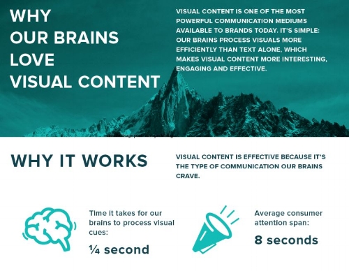
If you open a book or a web page, what does your eye notice first? Chances are, it’s a visual image.
According to research, as reported by Business2Community:
“In fact, the brain processes images 60,000 times faster than it does text. And it’s more accustomed to processing images—ninety percent of the information sent to the brain is visual, and 93% of all human communication is visual. Again, none of this is new or recent. The human brain has always processed images ridiculously faster than words…”
Without diving into the neuroscience behind it, our brains are wired to seek out visual information.
Here’s a little experiment:

(Sources: MIT and Column5Media)
Which of those screenshots did you read first? They present essentially the same information about how our brains process images, but one shares the information in graphic format. Even if the text-heavy page comes first, many (if not most) of us would process the second screenshot first. The graphic image makes it easier for a reader to comprehend the content.
Glorious White Space in Design
Finally, an often overlooked element in design: White space. Also known as negative space, what’s not on the page can have a strong impact on how readers respond to the information presented.
Again, what we try to avoid is large blocks of text and that blurred-out, gray-matter response from readers. We want readers to easily understand our message, and we make it so much easier for them to do so if we present content in smaller chunks.
Images, headlines, subheads and more go a long way toward breaking down content into a more readable format. Without white space, however, you still have a jumbled mess.
This graphic shows the power of white space, even without images:

(Source: graphiccomblog)
The example on the far right breaks down information into easily absorbed bits, and it even calls out key information using pull quotes, bold and more.
As we approach design, we consider all of these elements as part of the bigger picture. Every layout, image, word and color choice impacts how potential buyers will respond to a brand. You want a design that tells both your brand story and your brand personality, and each design choice can help carry those messages forward.
To learn more about our approach to multifamily marketing design, contact us. We specialize in creating unique visual stories and supporting marketing campaigns for each of our clients.

