What’s your type? The importance of font in design and branding
Here’s every graphic designer’s dirty little secret: We could spend hours looking at, creating and talking about fonts. We luuuurv fonts. That said, we know that most average people (read: everyone other than design nerds) don’t know much about font in design beyond Times New Roman and the {gasp} dreaded Comic Sans.
So, while you might not think much about the fonts you choose for your logo or your website, we do. When we work with clients, guiding them to just the right fonts and type treatments takes up a good chunk of our time.
Why? Because:
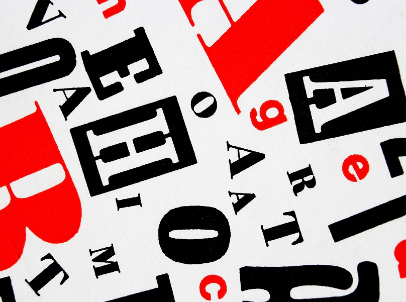
Fonts Have Personalities
Crazy talk, right? But your font can either say, in a friendly tone, “Yes, customer, this brand is for you!” or it can scream, “Don’t stop! Run!”
Let’s just drop these here to make that distinction clear:


(Sources: and fontspace.com and 1001fonts.com)
Yes, those are actual font names. We’ll take the chocolate, please. You?
So, before you choose a font, especially a font for your logo, think about your brand’s personality. Do you want buyers to see you as sophisticated or more down-to-earth? Are you modern or retro? Take time to list exactly the adjectives you want people to conjure when they think of your brand.
Fonts Convey Emotion
One survey asked 500 people to classify different fonts according to the emotion they evoked. Participants rated fonts like Arial and Times New Roman “conformist.” Georgia earned both “assertive” and “practical” labels, and users Impact “rude” and “rigid.”
That survey used a short list of only 20 common fonts (including the universally loathed Comic Sans), but the lesson translates to the thousands of font choices out there. From serif vs. sans serif to fancy scrolls and script, different styles of fonts evoke different responses in readers.
As you continue to think about your brand’s personality, also consider what type of emotions you want your potential buyers to feel when interacting with your brand. Keep in mind that you might use a mix of fonts (not too many), so you don’t have to feel completely hemmed in by one font’s attributes.
Fonts Impact Readability
When we talk about readability of a font, it goes beyond how well your readers can decipher words. For example, this is easier to read:

Than this:

(Source: 1001fonts.com)
When readers find a font more difficult to read, they also view the content as more difficult. According to Hubspot:
“…in a 2014 study, medical patients received the same set of at-home care instructions in different fonts, and the harder-to-read fonts made patients think the tasks were harder to do. This is an example of cognitive fluency, a theory that posits when our brains have difficulty processing information, the task at hand appear more challenging.”
Whether your content contains life-or-death information or simple marketing slogans, you don’t want font standing in the way of your message. You want your words to sing, and to stick with your audience. The right font will enhance your message without getting in the way of your story.
When you work with an experience graphic design team, they will walk you through all the elements of font choice.
Browse some of our client work to see what kind of brand personalities different fonts evoke. To learn more about our approach to design, marketing and branding for the multifamily industry, contact us.

